WHERE YOUR NEXT CHAPTER BEGINS

THE PROJECT
Real Estate Branding
This branding came about when discussing the needs of a new and fresh logo design that would appeal to all viewers and buys. The abstract of this work is here to show how the process and ideas that went into this work when designing a logo that speaks to upscale services, high value property and could be relatable to clients across the world.
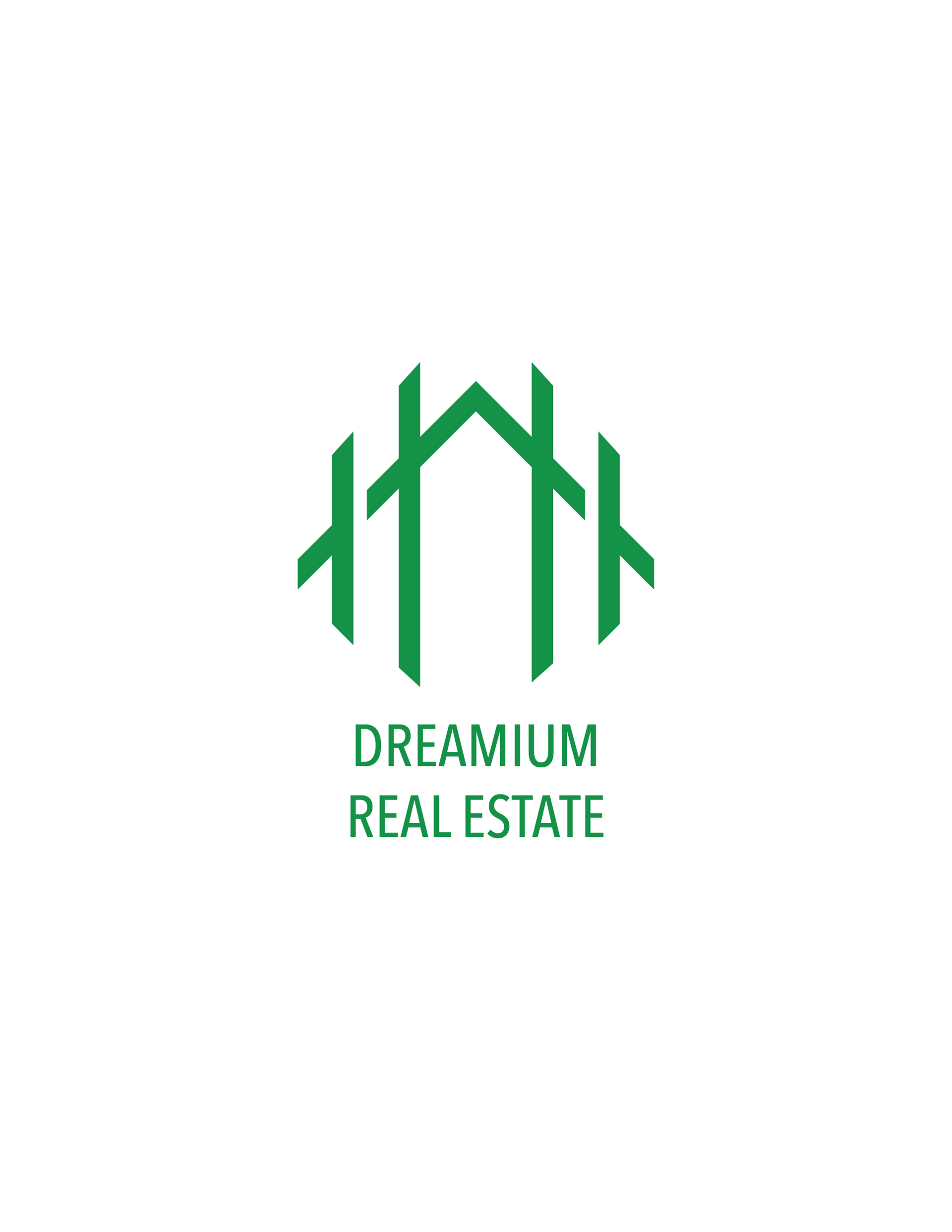
The first task in the real estate branding was to determine a unique design. The core elements of the designed implemented an abstract take on a general house with a fence to signal stability and privacy within a property.
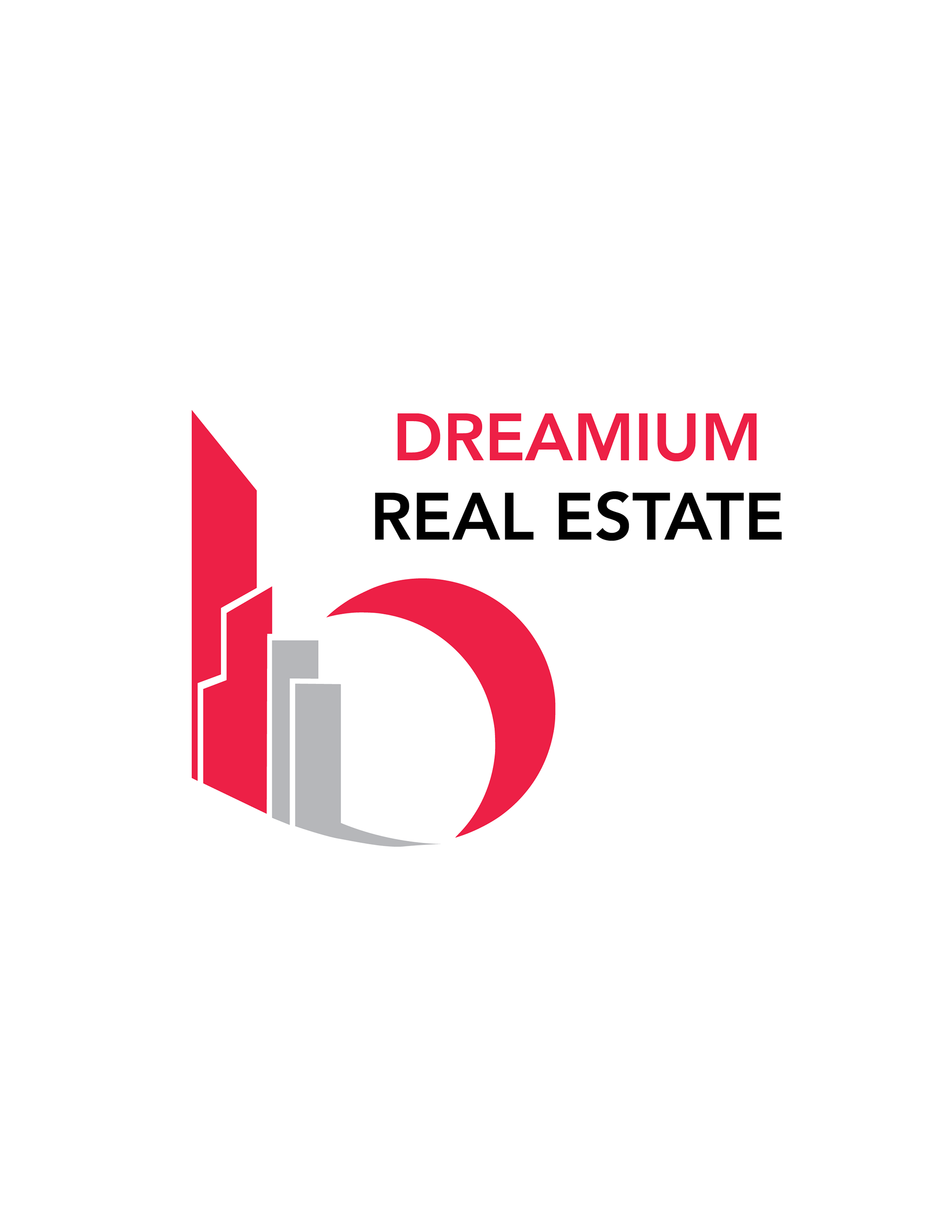
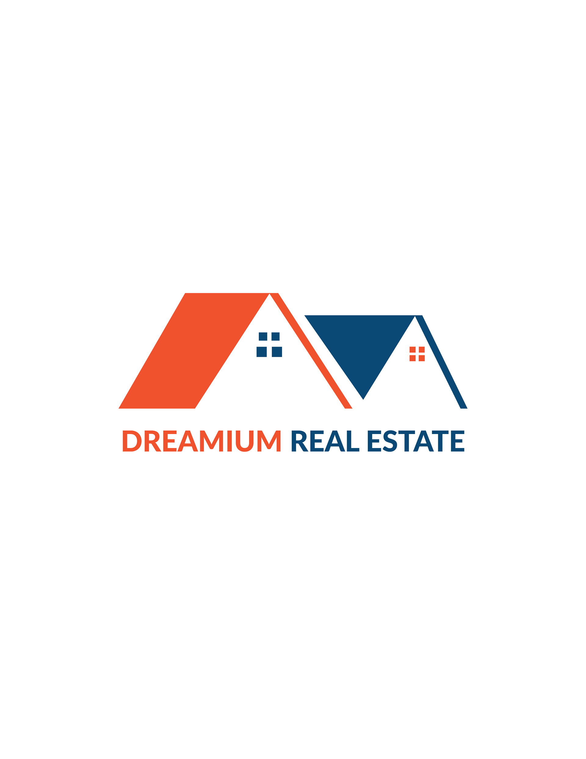
After confirming, then it was time to focus on the visual design. Instead of going the conservative route of most real estate firms, this design was meant to be "out of the box". The logo was presented in 3 concepts, all with a bright color palette, to represent a hip company with lavish inspiration.
Ultimately, the final logo that was used turned out to be the middle variation due to its simplistic and timeless feel it had. The green was also good as it was able to symbolize wealth and also serves as an invitation to the agency.

THE RESULT
Sophisticated Rebranding and Design Execution for a Real Estate Group
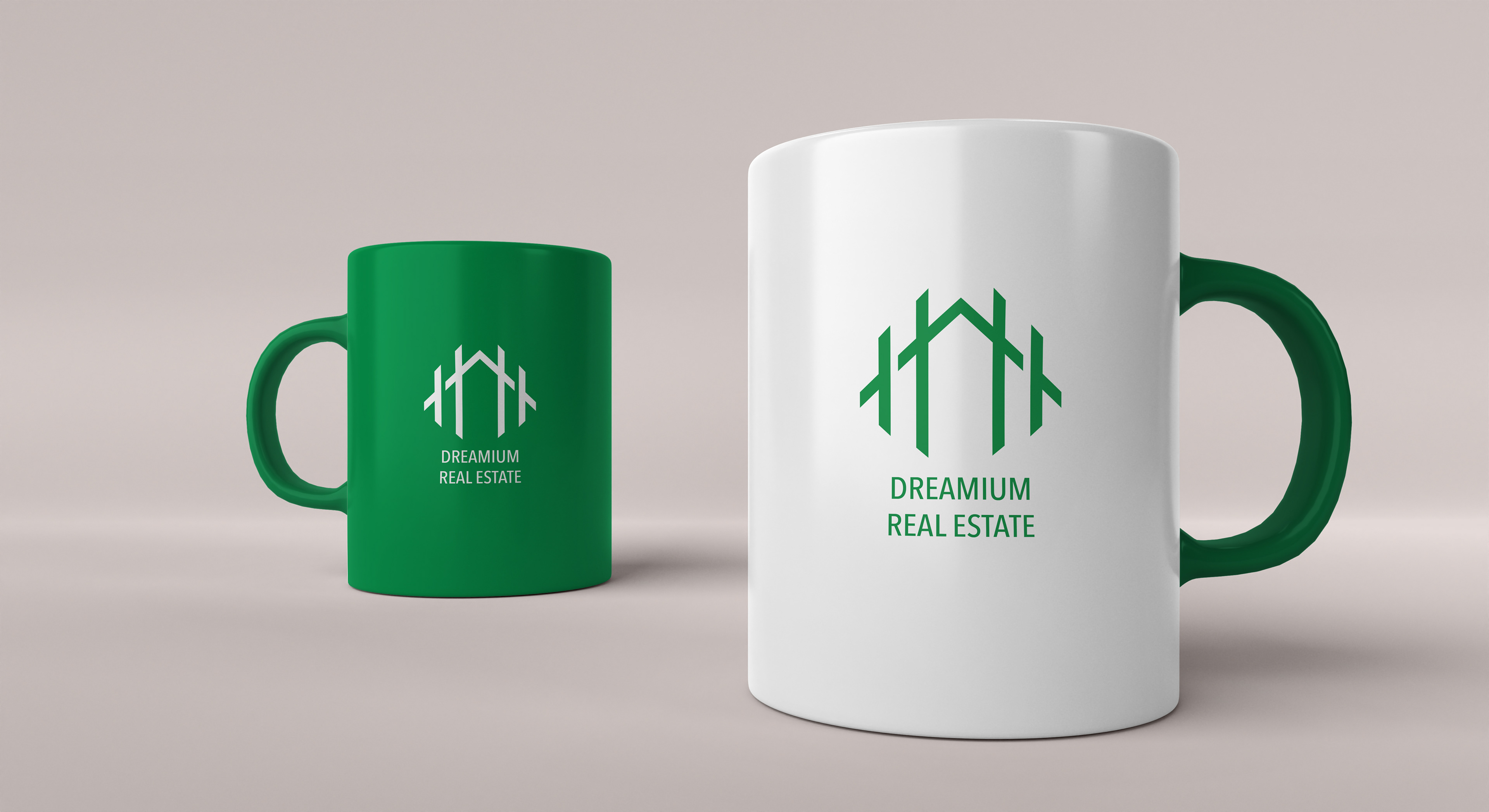
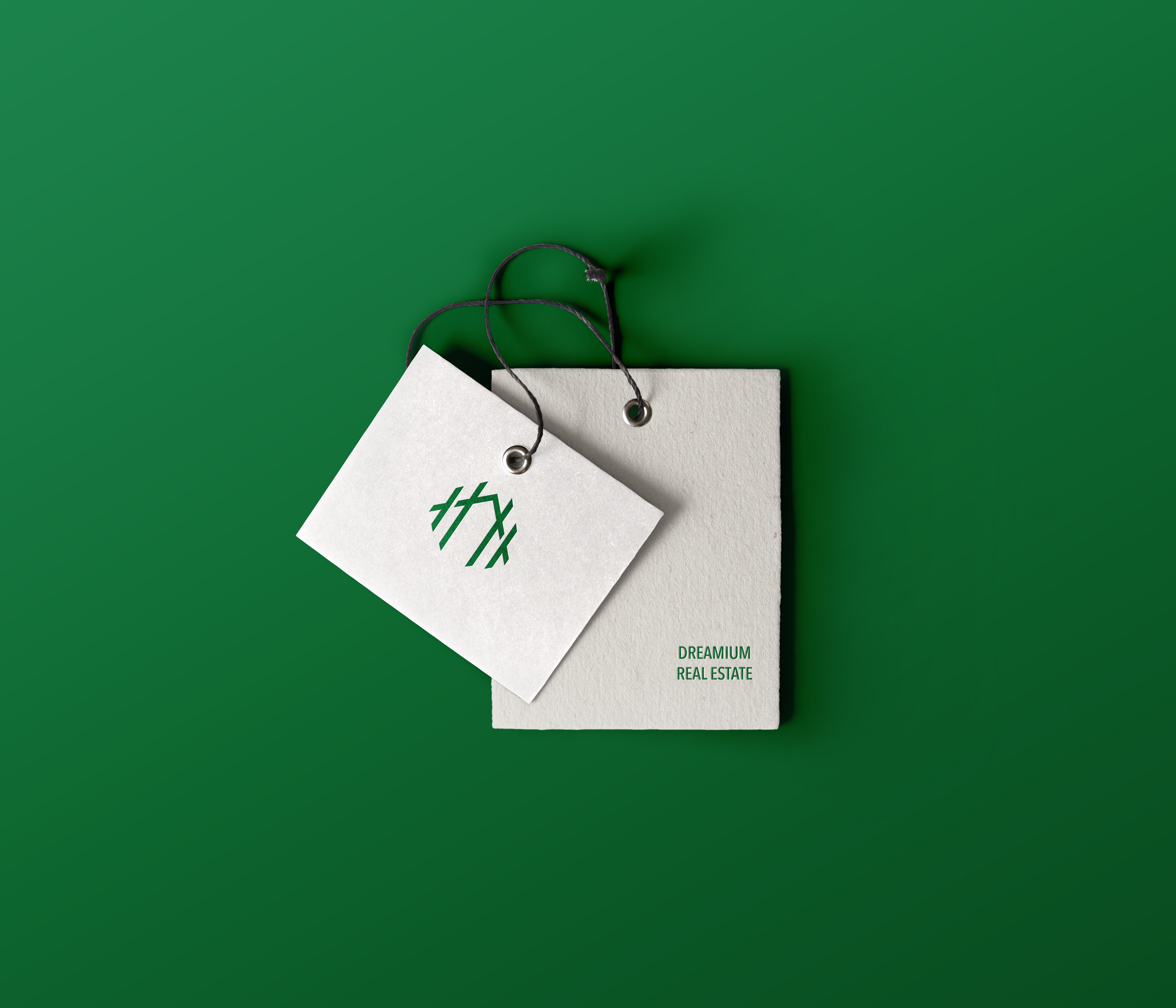
As said before, the final emblem that depicted the house along with a fence in an embellished green, provided a versatile, dual-purpose identifiable mark for Dreamium to use on any print or web application. The company name was flanked in a modern, sans serif font, with a hip color palette of green.
The brand logo speaks to the timeless and lavish foundation of the company and the sophisticated services offered by the firm. Diplomatic Designs provided a full scope of rebranding, including selecting a company name, building a visual statement and designing all firm collateral to support the brand.